Unlocking Connectivity Insights: Georgia Tech’s Revamped IODA dashboard
Georgia Tech’s IODA (Internet Outage Detection and Analysis) project has long been at the forefront of global Internet outage monitoring. That’s why the IODA team is proud to unveil a completely redesigned outage dashboard. This release sets a new standard for monitoring and analyzing Internet connectivity and disruptions worldwide.
Such an update brings together a highly intuitive interface, advanced visualization features, and streamlined access to critical outage data, offering users an unprecedented level of insight and human-centric usability. Whether you’re a researcher, network operator, policymaker, journalist, advocate or simply someone interested in the state of global Internet connectivity, the new IODA dashboard makes it easier than ever to discover, analyze and understand outages in real time.
What’s New in the IODA Dashboard?
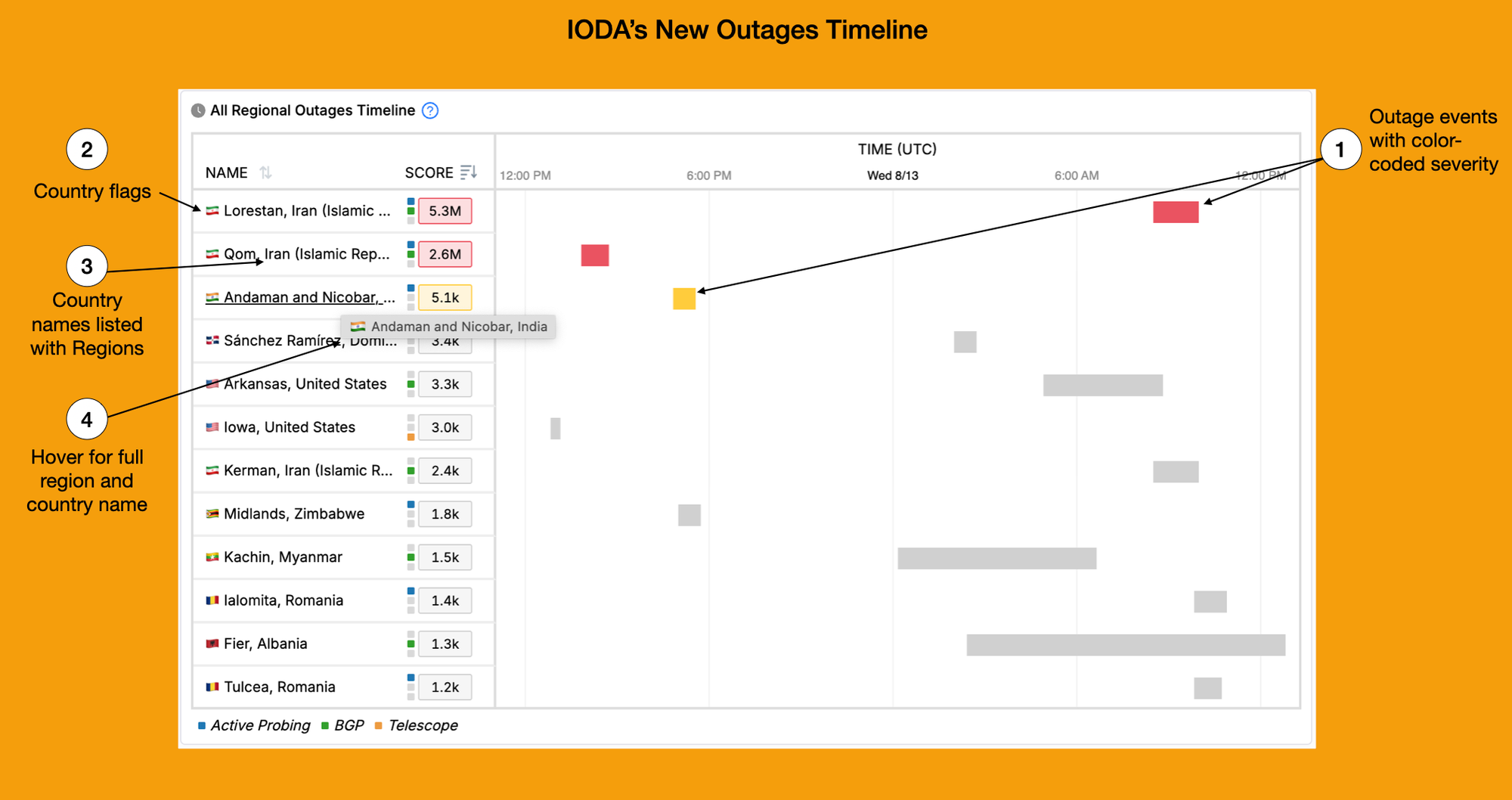
Outages Timeline View: Color-Coded Severity
Understanding the scope and impact of outages just got easier. The new Outages Timeline View displays outage events across time at the country, region, and ASN/ISP levels. Events are now color-coded by severity, enabling us to quickly identify significant issues and trends at a glance. This new view aims to improves the speed and accuracy of Internet outage discovery over time, making it ideal for both rapid response and in-depth analysis.
Enhanced Geographic Navigation
- Country Flags: Each country’s flag now accompanies its name, improving instant recognition and navigation across the global dashboard.
- Region with Country Names: In the regional outage dashboard, regions are now explicitly listed alongside their country names. This reduces ambiguity and ensures users immediately understand the scope and location of each outage event. Gaza, Palestine or Gaza, Mozambique?
Intuitive Country, Region, ASN/ISP Pages
IODA’s new entity pages provide targeted, detailed insights:
- Immediately exposed Alerts and Events: Users can directly access Alerts and Events table via new signal selection options. Immediate visibility shortens the time from detection to decision.
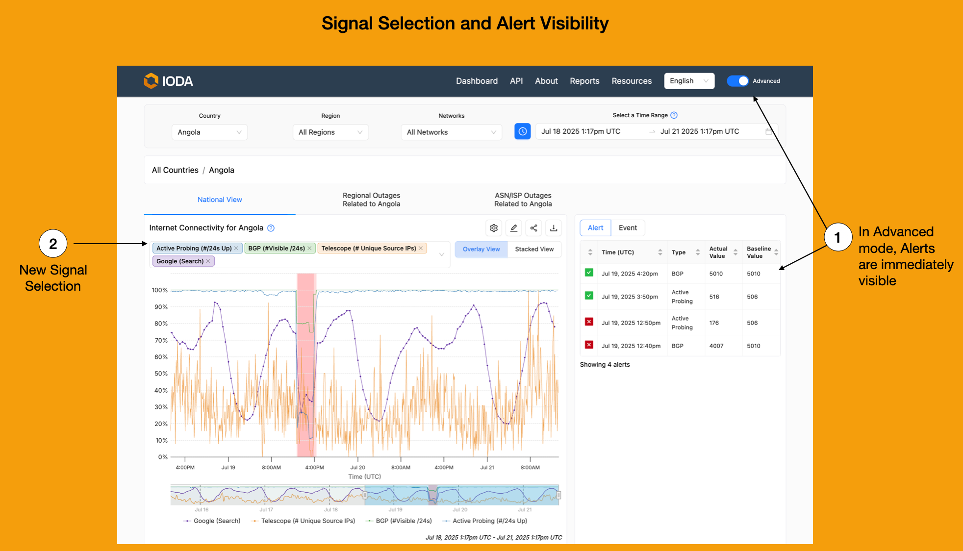
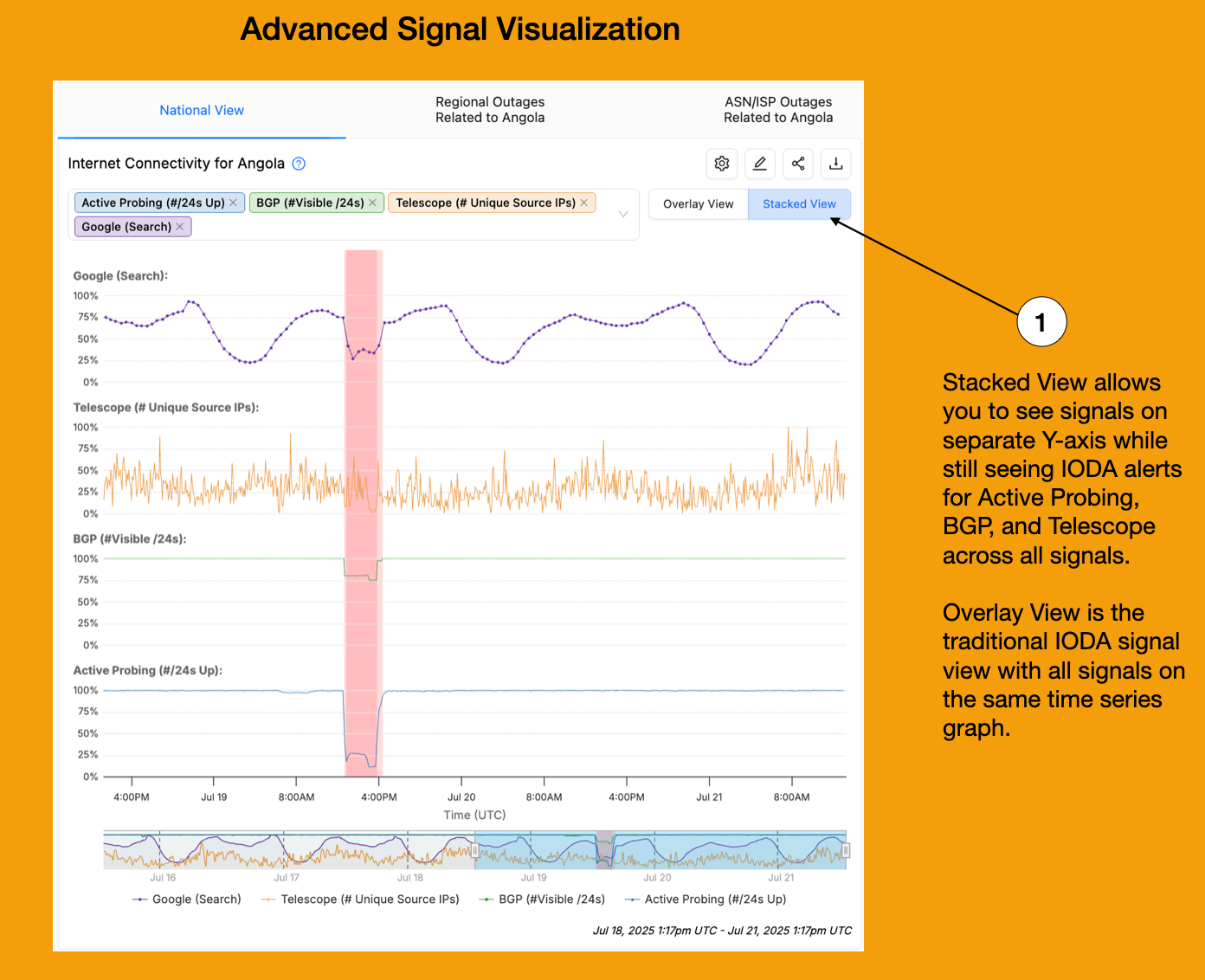
Advanced Signal Visualization
Monitoring and comparing connectivity signals is now more powerful:
- Stacked Signal View: Users can toggle a stacked view for all connectivity signals. Each signal (e.g., BGP, Active Probing, Telescope) sits on its own y-axis, but all share a common time (x-axis) and alert bands. This setup makes it easy to correlate disruptions across different layers of the internet measurements while avoiding confusion from overlapping or scale differences. This also supports the IODA team’s future plans of integrating additional signals, which could crowd a single time series graph.
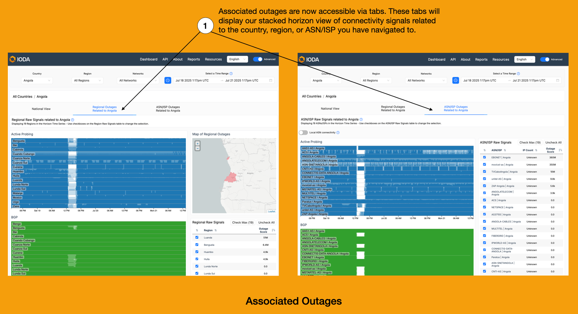
Seamless Exploration of Associated Outages
- Tabbed Associated Outages: A major usability upgrade, related outages for related regions, countries, or ASNs/ISPs are now immediately discoverable through tabs. This stacked horizon view consolidates previously hard-to-find data, empowering users to see associated disruptions and broader impacts with just a click.
Why Does This Matter?
The IODA dashboard overhaul delivers both broader context and finer detail. From a high-level global view to granular detail at the AS level, the dashboard now surfaces vital information more efficiently and intuitively for users. Among the key benefits:
- Faster detection of large-scale outages
- Equips IODA to integrate with Internet Measurement systems moving forward
- Accessibility for non-technical audiences through visual cues
- Greater transparency for governments, journalism, businesses, and civil society
IODA’s commitment to collecting and sharing open data and user-centered design ensures that anyone interested in the health of the global Internet can better understand and respond to connectivity crises.
Stay tuned as IODA continues to evolve!
This extensive redesign work would not be possible without our MS HCI students, Ura Design, and our front end developer, Annie Yang.